A switch, a radio group, and a select serve the same function: let the user pick one option from a set.
Which is best depends almost entirely on how many options there are.
- If there are two or three options, a switch is very clear and efficient. It lets the user see all the options available as well as which one is selected.
- If there are four or five, a switch starts to run out of horizontal space — but you can spare the vertical space, a radio-group also lets the user see every option at once.
- If there are more than that, a dropdown select probably makes the most sense — a user won’t be able to comfortable take in so many options all at once anyway, so tuck them out of view.
A checkbox group and a multiselect serve the same function: let the user pick several options from a set, and depend on the number of options in the same way as a single-select.
If you’re building a design system, my recommendation is to build each of these UI elements with a shared interface — RadioGroup should take the same attributes as Select — and then wrap them all in a single component: PickOne.
Give developers the option to force PickOne into a specific appearance, but for most forms you can simply let it choose, based on the number of options available.
A PickOne with three options: 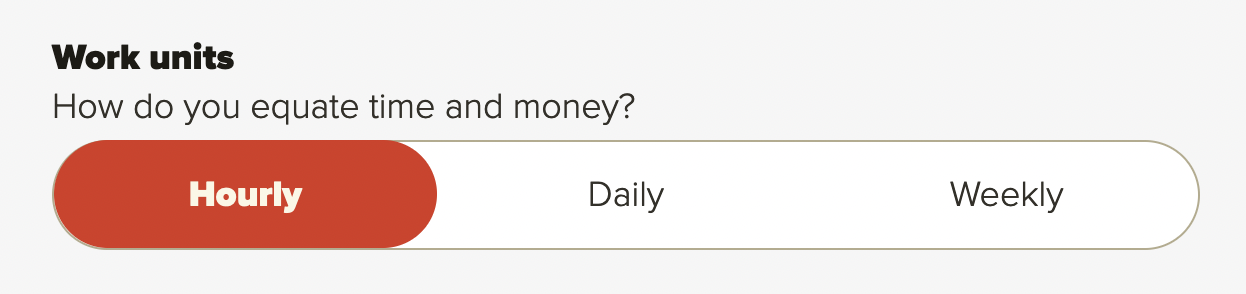
A PickOne with five options: 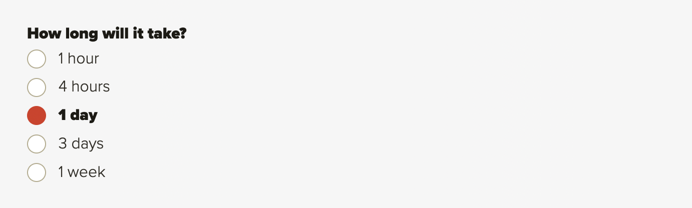
A PickOne with fifty options: 
The PickOne in my personal design system actually has 5 different appearances, not all of which can be sensibly selected programmatically — but I encourage you to think generally about organizing your components by what they allow users to do, rather than what they look like; and pick their final appearance late in the game, rather than early.