I’ve been doing a strange and possibly unwise thing in one of my apps for almost 18 months. So far, it’s seemed to work out, so I think it’s time to talk about it. It has to do with tracking the point of regard.
Point of regard is a fancy way of saying “the part of the app that currently has the user’s attention”. On the web, we’ll always have to guess about the point of regard — even if we had eye-tracking standard in every computer (ugh) we’d still not really know, even for sighted users — but we do the best we can.
Accessibility standards (like this one) tend to treat the focused element as the point of regard, with subfocus on the active element. That’s a very good guess for non-sighted users, and for users that don’t use the mouse. For mouse-only users, though, the point of regard is more likely to be under the cursor. For users that use both the keyboard and the mouse, there’s ambiguity. Our guess about the point of regard is fractured.
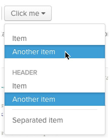
This is not just an academic complaint! It’s very easy to see in one common UI element all over the web: the autocomplete dropdown. Not everyone gets this wrong, but I searched for “dropdown component” and picked the first result, and here’s a screenshot after using both the arrow keys and the mouse:

There’s a visible hover-state and a visible active-state. The mouse controls the hover, and the keyboard controls the active item, and they move entirely independently of one another. What will happen when I press enter? Which will be selected?
Right now, you may be saying “Sure, it’s a little strange, but it works well enough, Sam! It’s never been an issue!” But what happens when I start adding more richness and power to the interface? What if I want to add keyboard shortcuts?
Keyboard shortcuts that apply universally are easy to implement and can do a lot, but they can’t do everything. Context sensitive hotkeys — copy what’s selected, delete this item — have a lot of power, with only a little additional cognitive overhead.
Text editors have diverse and powerful keyboard shortcuts because they have such a refined sense of the point of regard: the highlighted region (which often collapses to a single point).
But once the point of regard is fractured, how do you know which item should be copied, or deleted? If you’re comfortable pointing with the mouse, should you be forced to learn how to navigate the entire page by keyboard just to take advantage of a shortcut? If your real point of regard is at the tip of the cursor, why should keyboard shortcuts be locked to the active element?
A great example of this is Trello. Hover over a card, and hit ‘e’ to edit it. Hit escape, and highlight a different card using the keyboard (either hjkl or the arrow keys). Use ‘e’ and edit the newly highlighted card. They’ve unified keyboard and mouse into one point of regard! Great for them! Total success, right?
Right?
Unfortunately the highlighted card, even though it moves based on keyboard input, is not the element with keyboard focus. A screen-reader won’t tell you which card is highlighted, it will tell you what item is focused — users can hear one card but hotkeys will effect another. What Trello has done is invent a third, new kind of point-of-regard guess, which is neither focus nor hover, and which integrates with neither the browser nor accessibility tools like screenreaders.
Now the stage is set for my reckless and bizarre plan: unifying focus and hover. What if in card lists like Trello, there was no hover state, there was only focus? And what if focus mover both with the keyboard and with the mouse — whichever one the user chose to use?
From my past year+ of experimentation, this appears to be a plausible pattern. Focus drags screen-readers along with it, thus unifying the possible points of regard into a single guess, which can easily receive keyboard commands.
There are some subtleties; the most obvious javascript solutions to focus-on-mouseover are prone to firing accidentally when the page scrolls or when the DOM is updated. Care must be taken to decide whether the user is moving the point of regard, or if the mouse is sitting idly as the page changes beneath it. But this is a surmountable problem. The reward is a system of point-of-regard that eliminates not only usability problems, but also any silly two-highlighted-elements visual puzzles, and makes possible truly powerful, context-sensitive hotkeys.