This was intended to be an essay about web design; but reading it over, I’ve used the vocabulary of a pretentious art critic. It happens, sometimes.
I. What is a forest?
Digital design is obsessed with content. Everything choice is made to center content and drive users to consume it. Today, someone asked me what the difference was between “consuming content” and just looking at the world. “Isn’t everything content?” they asked. But while everything may be readable as text, not everything is content. Imagine, for example, a forest.
Everywhere you look, in a forest, there is something to see. The closer you look at any square inch, the more rewards you will find. There is life, and detail, and interest everywhere. And yet, the forest is a relaxing, low-intensity place to be. We unwind there. Why is that? Despite the fact that every place you can rest your eyes is filled with information, none of it demands your attention. It isn’t aching to convey that information to you; it’s not calling out to you. You are free to choose where to let your eyes rest, and what to ignore; whereever your eyes fall there are riches, and whatever you ignore remains largely invisible.
A forest is the anti-website; there is no funnel, no call to action, no bounce rate. When you get bored or distracted or want to rest, you don’t go elsewhere — you do elsewhat. You sit on a rock, you stare at the sky, you look at a bug, you play with a stick.
Such things can be intentionally brought into a space; see Gongshi, as an example of a semi-manufactured place to look without intent.
The tyranny of the funnel has brought us to build digital spaces where at best there is exactly one thing to do, and at worst the screen is filled with competing visuals all vying for your attention.
Unlike a website, a forest is a place where close-looking is both rewarded and unnecessary.
II. The Thresholds of Perception
There! Near the borderline Right between two countries — They Might Be Giants
Lately I’ve been playing with one specific approach to rewarding close-looking; it’s by no means the only way, or even the best way, but it’s a way.
One of the most amazing things about human vision is that it adjusts to stimuli over time. We can see details both in light and in shadow while out in bright daylight, but, given time to adjust, we can also see our own shadow by the light of the moon. We don’t have that kind of discrimination over our whole range of vision simultaneously, but once adjusted, we have it when we need it.
Our slowly-adjusting fine sensitivity is present both for changes in brightness (value contrasts) and changes in color (hue contrasts); There’s plenty of precedent for artists exploring what the smallest perceptible contrast is, both in value and in hue. Ad Reinhardt’s Black Paintings are made from exceedingly dark, exceedingly low-chroma colors; they contain hue differences that become apparent only after several minutes of looking at his paintings, and they’re almost impossible to meaningfully photograph or reproduce. So here’s a photographic reproduction of one:
 (Look very carefully, and you can just about see the canvas divided in thirds horizontally and vertically; the corners are red, the horizontal center bar is green, and the top and bottom are blue.)
Along a similar vein, works in James Turell’s Dark Spaces series are dark rooms that contain projected color fields which only appear after patient minutes of looking. In much of Turell’s work, he walks your vision right to its breaking point, and many times you’re not entirely sure if what you’re seeing is really there, or a hallucination. Though it is a real artifact, the experience of it lies right on the border between the subjective and the objective.
What’s most important to me about these experiences, though, are these two qualities:
- they necessarily take time to see
- they are invisible when your attention is elsewhere
These map reasonably onto the two properties of close-looking in a forest: the reward of seeing requires time invested, and the invisibility makes looking unnecessary unless desired.
III. Doing it Digitally
All this Capital-A Art is very inspiring, but maybe impossible to recreate digitally; both Reinhardt’s meticulously-painted matte surfaces and Turell’s body-encompassing light paintings are really very analog, very physical things — they’re almost impossible to photograph, let alone mimic within the limits of a screen. But if we’re to try, we’ve got to nail down what, exactly, the limits of a screen are:
- A screen takes up a limited field of view
- we cannot control the light levels or colors in the surrounding space
- the gamut of colors a screen can display is really narrow compared to the human eye’s ability to see
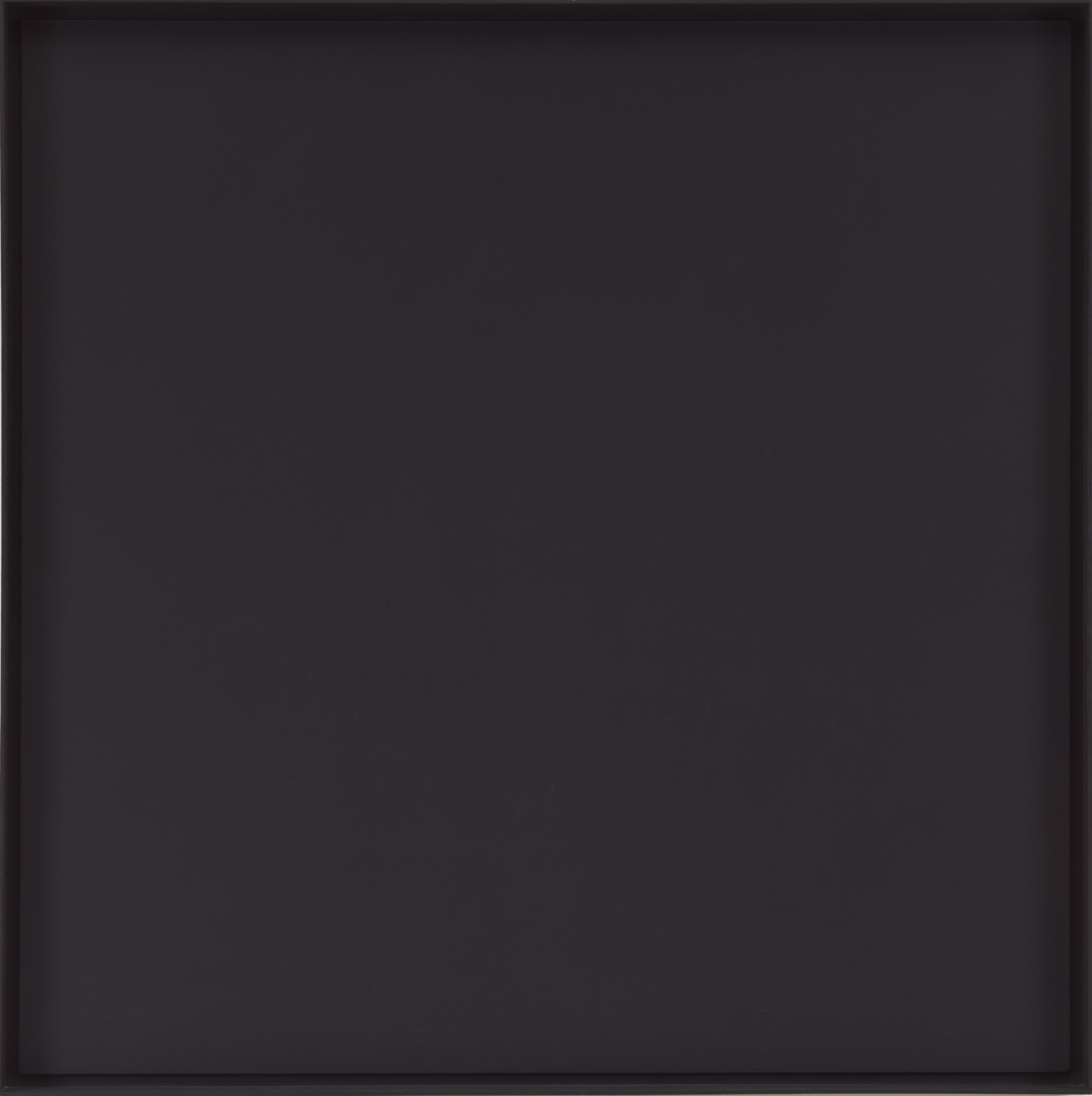
We need some way to pick colors which are only barely distinguishable from one another, but are capable of being displayed on-screen. Common rgb, cmyk, and hsl color pickers are terrible at that task; they are tools of engineering convenience rather than measures of human vision. The correct color spaces to use are CIEL*a*b* and its transformations; they are specifically designed to be nearly-perceptually-uniform, and 1 unit of distance in CIEL*a*b*-space is approximately equal to the smallest color difference perceptible by humans. My recent journey through color science is an essay for another time; but the punchline is that I built Pigmentor, a tool for picking colors in the CIEL*a*b*-associated Lch space.
Using Pigmentor, I can easily and quickly pick colors which rest right on the edge of being distinguishable, and produce apparently-gray squares, like this:
which, if you stare at patiently, you’ll find contains moving stripes of color. Each color has precisely the same lightness, and the same chroma; only the hues are shifted (the hues, though, are actually dramatically different). If you’re in a uniformly-lit environment (dimly lit is even better) then the longer you stare, the brighter and more obvious the stripes become. When I first finished it, having been staring at it for hours, I was convinced it was a failure; it was too brash, too garish and distracting. It was only when I showed it to people who had not stared at it all day, and watched them take several minutes to see the stripes at all, that I was convinced.
Here’s a similar (but more obvious) effect; it mimics the dappled light in the shadow of a tree:
This one is much more obvious, because it uses non-zero value-contrast, where the stripes exercise uses hue-contrast. Value is a tyrant, and matters to your eye more than anything else; and this value contrast is ~10 times the minimum distinguishable difference.
Epilogue
These effects are obviously just toys, at the moment. They hardly even count as proofs of the concept. But I’m encouraged; I think it may be possible to break the false dichotomy of minimalism vs. maximalism. Maybe we can create digital spaces in which, when you need a moment to think, a moment to zone out from demanding content, there is space for that. Rather that turning away to twitter or facebook or another advertising platform eager to steal that moment of relaxation, maybe we can build digital scholars’ stones and forests to accompany our more directed content; environments where taking a break from reading is welcomed and rewarded.